In recent years, Wiley's method -- or gimmick, if that word is permissible -- has been to place his subject against an abstract, seemingly-flat background, somewhat like a seamless vector pattern, which pops into the foreground in interesting ways. Here's an example.
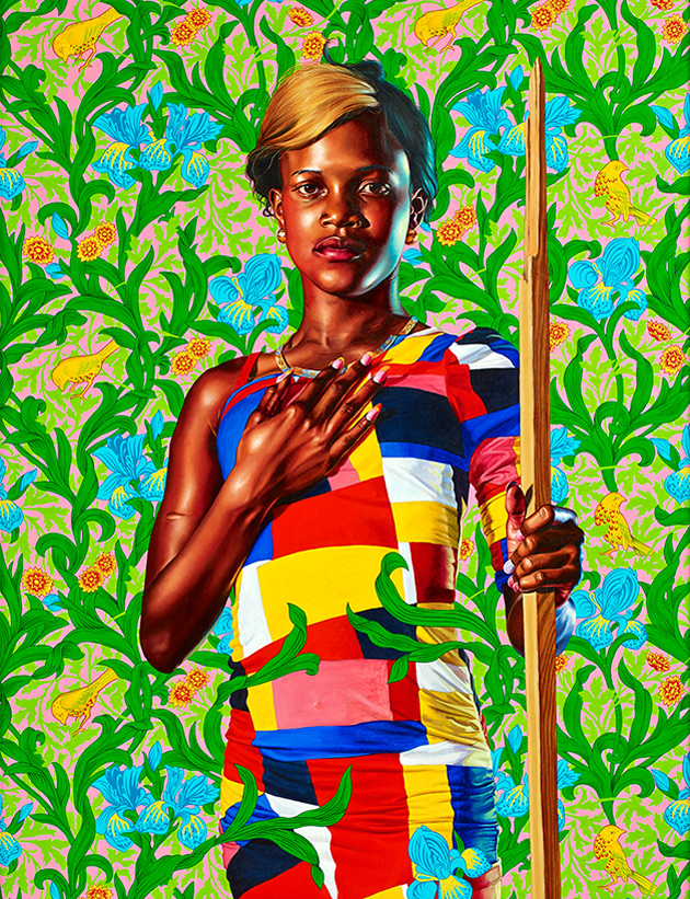
Terrific piece, innit? I think it's masterful.
Unfortunately, when Wiley does "normal" backgrounds, the results are less happy. Look here.

The well-executed figure doesn't mesh at all with that poorly-painted seascape. The whole point of doing a seascape is to explore the wide variety of color one invariably sees in the water. When Wiley painted this ocean, I doubt that he opened up any tubes of paint other than Viridian. Worse, the water looks like a kind of plastic.
The biggest issue I have with this painting is the mis-match in lighting. It's supposed to be an outdoors scene, but how many suns were out that day? And why is the sun on the right radiating a cool light onto the man's skin?
Like the great cinematographers of the 1930s, Wiley loves dramatic studio lighting, with multiple light sources. This is what gives his figures such a feeling of volume, of three-dimensionality. This lighting scheme usually works well with a semi-abstract background, as in our first example, but it doesn't work when the scene is set outdoors.
Now let's look at Wiley's official portrait of President Obama.

Much is being made of the symbolic meanings of the flowers shown here. I don't care about that. Painting is not literature.
I love much in this painting, but on the whole, I just don't think it works. Once again, the studio lighting says "We are indoors" -- yet the foliage says "We are outdoors." The lights hits Obama's face from two directions, so why doesn't either light source cast any shadows beneath the chair?
Wiley tried to have it both ways in this image. The foliage is supposed to function as a semi-abstract background, as in our first example. But the foliage also reads as realism, as a three-dimensional space in the real world. The green of the leaves is reflected on Obama's suit -- so why doesn't the suited figure cast a shadow on the leaves? Why doesn't the seated figure affect his environment in any way?
I hate to criticize a work like this. The artist obviously put an enormous amount of effort and talent into it, and he really, really knows how to paint. Just look at the suit fabric: It's beautifully handled. How many times have we seen artists over-emphasize the highlights in a dark suit?
Beginning artists should look to Wiley as a model. But this piece doesn't do it for me.
Question: What should Trump's portrait look like? Oh, I would love to have a go at that. Maybe something like this, complete with bayonet mark.
5 comments:
At higher resolution it looks better to my eye:
https://www.nytimes.com/2018/02/12/arts/design/obama-portrait.html
What would be appropriate for a portrait of the Great White Dope since the media is the message?
Crayon.
Etch-a-Sketch.
Paint by number.
Monkey poo.
Please say something about Michelle's portrait. My wife LOVES both of them to an unrealistic degree and when I tentatively voiced my doubts about the Michelle piece wifey would have none of that crap.
So please Joe, give us your thoughts on the Michelle piece.
Paul, I was kind of hoping NOT to address that topic because Amy Sherald lives here in Baltimore. Then again, I don't get out very much, and even if I ran into her, she probably wouldn't care very much about what I have to say.
I think it is a very elegant, spare, flat composition. In some respects, I like it better than the Barack Obama portrait.
But there's something off about the face. I know that many people are saying that, but it's true. If I did not know that this was a portrait of Michelle Obama, I would not be able to name to person in the picture.
I'm not sure what the problem is. I think one issue is that the mouth seems to be resting, yet one corner jerks up toward the eye. The eyes and the mouth are not really parallel, are they? They describe two lines that will soon intersect. That's the right way to draw (say) Brian Williams, but not Michelle Obama.
John Singer Sargent said that "A portrait is a painting with something wrong with the mouth." In that sense, this painting is Sargent-esque.
Also, I'm not sold on the decision to keep the darkest darks at the level of a grey.
Wiley is easily the better realistic painter. When it comes to rendering the human figure, that guy paints like nobody's business. But Sherald's composition is extremely good. This painting succeeds as an abstract, or as a near-abstract. As a portrait, it fails.
Thank you for your kind reply.
Post a Comment